Yazmin Feliz
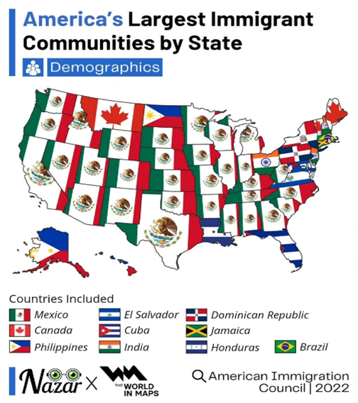
The images I chose connect directly to the main point of my synthesis essay, that the United States has always been linguistically diverse, and this diversity affects how English accents develop. The first image, the map showing “America’s largest immigrant communities by state,” helps me visually show how many different cultures and languages exist across the country. Instead of only explaining immigration with words, the map makes it easy to see which states have big populations from places like Mexico, the Dominican Republic, India, and more, (Not including Native American population). This image supports my argument because it proves why English sounds different depending on where someone is from. This map is located on my essay, in the section where I talk about the history of immigration and how everyone has an accent even in Standardize English.
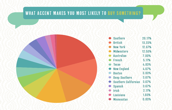
The second image, the chart called “What accent makes you most likely to buy something?”, connects to the part of my essay where I talk about accent bias and how some accents are judged more “professional” or “trustworthy” than others. This chart shows the results of an experiment that people in the United States prefer certain accents over others, which is the same idea I explain in my essay when talking about how Standard English is treated like the “correct” accent. It helps readers understand that accent discrimination still happens in everyday situations, even something as simple as deciding whether to buy a product. Demonstrating how different accents in English affect people’s opportunities.
Both visuals make my synthesis stronger because they give clear examples of my main points. The map shows the diversity of the United States with different accents from worldwide, and the chart shows the bias society has toward certain accents.